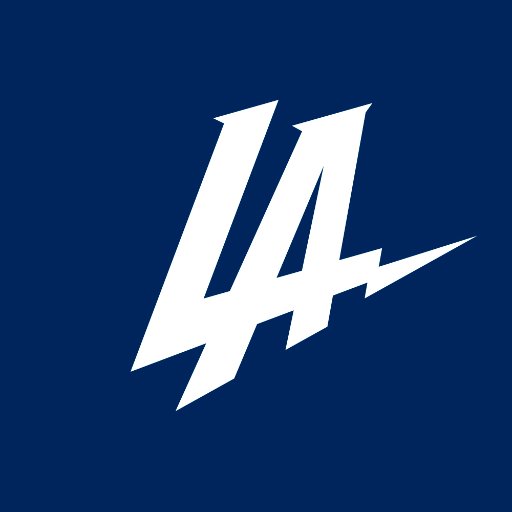
New Logo Fail: The San Diego Chargers unveiled a new logo today, to coincide with their move to Los Angeles. After several years of asking the city of San Diego to build a new stadium the franchise is taking their show to a new location. They decided, I guess, that they also needed a new logo. Most sports fans who live in the L.A. area saw a lot of similarity between this ‘new’ logo of the soon to be named Los Angeles Chargers, and the beloved baseball team.
San Diego… Los Angeles Chargers’ New Logo Fail

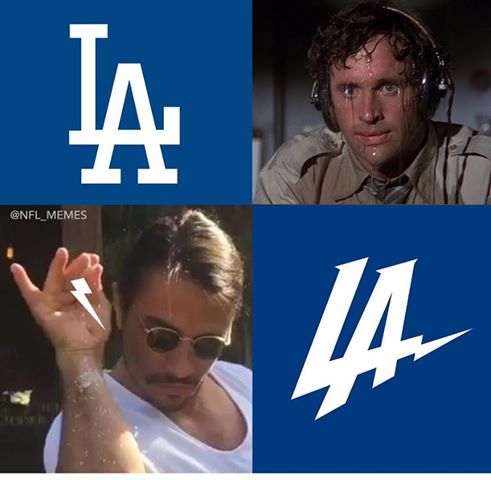
Already, several jokes have hit the internet.
As you can see it’s really a clear rip-off. (future reference Salt Chef Meme)
This is a New Logo Fail with several important lessons for business owners.
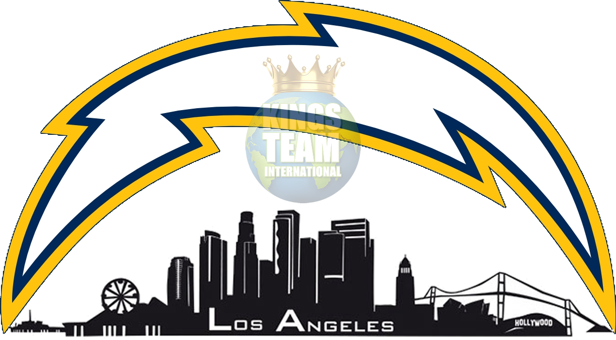
I actually put together 2 examples of logos the Chargers should have come up with. When you’re dealing with a franchise that already has a ‘tradition’ which the Chargers do, it’s worth hanging onto. I won’t sit here and say that I am a fan of their lighting bolt but, it’s been their symbol and there’s no reason to change that now.
Meanwhile, if the owners really wanted to incorporate Los Angeles into that new logo, what better way than this? (see our rendering below of what their new logo ‘should’ have looked like)
Something ‘like this’ at least. Had either of these been the “New Logo of the Chargers” I doubt very seriously there would be anywhere ‘near’ the disrespectful reactions and memes rolling out.
Then again, that’s what we do here at KingsTeamInternational.com
(feel free to hire us for a consultation, especially considering your logo if you don’t have one; or need to update it. *end of shameless plug – Check out the work below)


Quick Disclaimer here; I did NOT draw this skyline. Nor did I re-touch the original Charger Logo. My point here with these renderings is that they could have hired someone to put this together; and it would absolutely go over well. I mean aren’t you thinking about telling them to go with something like this too? Feel free to let them know I’m easy to reach for compensation.
The Lesson for business owners is that when you have already spent time branding your business, and decide it’s time for a change, really seek out some good business consultation. I don’t know who the Chargers hired, but many people are shaking their heads at the decision to go with a new logo that might get them sued by the Dodgers for copy write infringement! Don’t scrap your brand, build on your brand. Improve on what you’ve already built.
People who already have a ‘relationship’ or an ‘association’ with your company based on your logo. Believe it or not, logos matter. They speak to your target market in ways that words often do not.
Everyone familiar with that lighting bolt will now feel like they’ve been abandoned too, not just the city. It comes across as ‘personal’, to the fans who spent a lot of money over the years buying apparel with that lighting bolt on it.
Meanwhile, people who are fans of the L.A. Dodgers don’t like the idea of another team copying their log which they love.
No one writes L.A. like that, and to do it using the blue and white colors too?
This isn’t a good introduction to your ‘new’ city either. Several lessons inside this new logo fail. Let us know if you’re thinking of redesigning your logo, or website. Let us help you make the right decisions to propel your business forward – and improve on the relationships you’ve already built with your customers.


Pingback: #CreativeSmartGirl : A Twitter Business Conversation